Mike Cougill’s excellent post about story influencing layout design brought back some thoughts I jotted down about composition, and that take on new significance as I think about the layout’s role in the room. Mike’s layout tells a completely different story from Pembroke, but perhaps we can both take some lessons from the art world to help us tell our stories.
One of the many things that makes the application of artistic principles of composition to our hobby somewhat challenging is that railroad models are three dimensional, while most resources about composition are aimed at painters. We really want composition lessons aimed at sculptors, or even opera set designers, but both my local library and Amazon come up dry. A web search yielded a couple of resources. Thea Resila usefully asserts that “sculpture shares the same elements and principles of 2-dimensional art, but works in a 3-dimensional space.” She also notes that “in 2 dimensional art, line defines form, but in sculpture it is the opposite.”
Headforart provides a useful analysis in her comparison of Davids by Michaelangelo and Bernini:
If Michelangelo’s David presents a harmonious figure arranged around a contrapposto pose and best seen from a frontal viewpoint, then Bernini does a complete 180. His David is 3D proper and by that I mean begging to be seen from all angles, in motion.
- Mike’s layout is about parking his bones in one spot to watch the action, and a harmonious composition is appropriate for him. He found that the layout works better in a certain corner of the room where the observer feels sheltered. For him, Michaelangelo’s David is the right model.
In my case, I hope to portray the dynamism and optimism that marks the opening of Canada’s Century. I am looking for more Bernini – to engage the viewer in a way that makes them want to move through the scene.
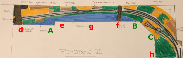
Like Mike’s layout, Pembroke’s situation and shape in the room make people naturally gravitate to certain locations. Anecdotally (there is no science here), A, B and to a lesser extent, C seem to attract people. Most people do not approach the layout at the points marked by lower case letters above.
Let’s start looking slightly to the right at C as nobody ever goes to h. Here we have mostly negative space. The water tower could be sufficient to keep the viewer from running down the track to Golden Lake and off the layout, and perhaps the dominant lines of the track and sky pull the viewer to the left as we would like. That piece of plywood on edge at the far right is meant to be Lee Manufacturing, but now that I see what I’m trying to do, I think it should get de-emphasized. The building itself could even be suggested off-layout.

Turning to the left, the scene changes to the turntable, roundhouse, and cattle pen beyond. I used to consider the view from C disappointing, but existing lines make you want to move to B, and movement is exactly what we want. In later years, there was a pole outside the roundhouse that might keep the viewer here; I don’t know if it was there in 1905, but maybe it needs to be elided to keep the viewer moving. I feel there should be a focus point at one of the stars.
Many people approach the layout at B, perhaps because the only finished building, the roundhouse, is here. With the pine trees, the bridge and the edge of the roundhouse, we get a clear focus point at the road crossing. However, this scene is hardly dynamic or optimistic: it’s literally a potato field. I need something to pull the viewer to the left and into town, but the stand of trees, the bridge and road were all really there, and make a hard stop. Moreover, the wooden bridge makes a nice counterpoint to the stone bridge at the other end of the layout, and helps to support the story of growth.
If we can pull the viewer past f and over to g, they land in a sea of negative space. Even the clouds are quiet here. It is no wonder so few people are attracted to it. This part of the layout needs a rhythmic element to pull us along to A. I’ve mocked up houses that are side-on, but in actual fact, there were three or four gable ends here, as well as what I believe was the coal yard. I’ll have to mock those up to see how they play.
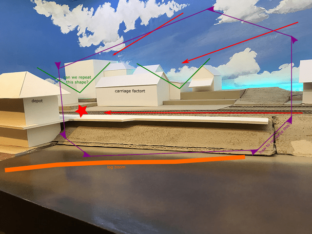
The layout at A is where all the excitement is. In contrast to the wooden buildings further south, here we have an emerging modern city, hacked from the bush. There are stone and masonry buildings, telephone and electricity lines, and the dam all jumbled excitedly together. There is a lot going on in this dramatic scene. The strong shapes of the sky and roofs help to pull the viewer into a focus point at the platform, where a train could conceivably take the viewer back to the rest of the layout (this is one advantage we have over sculptors).
Of course, I am almost certainly over-thinking this composition business. Indeed, back when I was doing more painting, my favourite pieces were the ones where I didn’t think about it too much. I’ll have to be careful, and as always refer to the prototype for the real inspiration.

This post and the discussion of Mindhiem’s book on the model railroad as art has me wondering if we are trying too hard. Each scene we choose to portray is often compressed and foreshortened. Each is often too close to the next and hard to imagine a mile or so away from one another but you’ve touched on something that may give us a reprieve from trying to keep the viewer from taking it all in as one piece of work.
Like exhibits, each scene can stand on its own. The quiet space between providing the transition needed from the “hard stop” of a bridge or building that forms a frame around the focal point of interest (not that the negative space can’t be interesting as well – just as the walls or museum itself can be of interest).
Architecture is, or possibly should be, art in its own right and capture the attention just as any piece in three dimensions. It begs to draw you in and through the piece but could overwhelm if every surface attempted to grab attention. We often refer to such designs as gaudy or overdone.
Thanks for giving me something to consider on a Saturday morning before I head up to the train room. A new point of view helps focus my effort and keeps my interest high.
Neil
Thanks, Neil. I hadn’t thought of it in respects to larger layouts before with shortened scenes too close together, but with two distinct scenes, I guess Pembroke illustrates how stories could be told through layouts that stretch for many scenes coupled together by too-short mainlines.
Rene:
I agree that your layout does present an opportunity to illustrate this concept. My current own layout has been greatly influenced by yours so am following closely. The idea of a one-town layout has captured my imagination so will share on MRH as it progresses.
Neil
Looking forward to it, Neil. Will it be On30 or in the garden?
Not overthinking it at all, Rene. In fact, your attention to storytelling through composition, and attempt to convey the sense of dynamism and optimism of your chosen era and locale through the very composition of the layout itself is an incredibly fascinating rare perspective to undertake in the hobby. Not many modellers would likely appreciate it and fewer still be successful trying to realize it. Kudos to you, and I think you are very much on the right track!
Thank-you Brian.